| TL;DR: Start with one core identity design, one premium everyday design and one seasonal design. Prioritize readability, official colors and a layout that works on hoodies, tees and hats. Design for decoration limits early so the final print matches the mockup. Add clear product and placement guidance so buyers know what to choose. |
School spirit wear designs combine a school name, mascot, colors and typography into layouts that look good on apparel and accessories. A strong design reads clearly, feels on-brand and works on the items your community actually buys.
Most schools want gear people wear regularly, not a one-time event shirt. The usual problems are unclear artwork, mismatched colors, the wrong product mix and designs that feel too busy or too niche.
This guide shares 12 design formats that work across K-12 and college programs, plus placement and product tips you can use to choose the right three designs for a new store.
What Makes a School Spirit Wear Design Sell Well
- Clear school identity: school name or mascot is easy to recognize at a glance.
- Official color match: colors align with school brand guidelines and print reliably.
- Readable typography: text stays legible from a distance and at small sizes.
- One focal point: the layout has a clear hierarchy and avoids clutter.
- Product fit: the design works on hoodies, tees, crewnecks and hats.
- Broad appeal: students, families, staff and alumni can all wear it.
- Print-ready art: line weight, detail level and color count match the decoration method.
12 School Spirit Wear Designs That Sell Out Fast
Below are 12 design formats you can reuse across products. Each one includes the purpose, best placements and a few print-safe tips.
- Classic school name + mascot lockup: An official-looking layout that works as a store staple and reads clearly on most products.
- Varsity letterman typography: Collegiate type that feels athletic and traditional, especially strong on hoodies and crewnecks.
- Minimal crest or badge emblem: A compact, premium mark built for left chest and hats, with clean lines and controlled detail.
- Retro vintage distressed logo: A throwback look that adds character while keeping the school name bold and readable.
- State or city pride map design: A local identity design that pairs place pride with school branding, popular with families and alumni.
- Sport-specific team edition: A seasonal format that supports one program at a time and is easy to launch around schedules.
- Senior class and graduation year: A milestone design that drives group orders and keepsake purchases for one class.
- School chant or slogan typography: A short, school-specific phrase that feels like belonging and works well as a statement tee.
- Mascot character illustration: A mascot-forward graphic that adds personality and performs well with student audiences.
- All-school pride design: A broad, inclusive message that works for staff, parents and supporters year-round.
- Limited edition event drop: A calendar-based design that commemorates a moment and encourages orders without hype language.
- Monogram or initials mark: A subtle, wearable mark that is ideal for hats, quarter zips and staff-friendly apparel.
Quick Pick Matrix: School Spirit Wear Designs
| Design format | Best for | Best placement | Best products |
| Classic school name + mascot lockup | Broad audience | Full front or left chest | Hoodies, tees, hats |
| Varsity letterman typography | Students and alumni | Full front | Hoodies, crewnecks |
| Minimal crest or badge emblem | Staff and parents | Left chest | Quarter zips, hats |
| Retro vintage distressed logo | Alumni and older students | Full front or back | Tees, crewnecks |
| State or city pride map design | Families and alumni | Back print or centered front | Tees, hoodies |
| Sport-specific team edition | Team families and supporters | Full front or back | Tees, hoodies |
| Senior class and graduation year | Seniors and families | Full front or back | Tees, hoodies |
| School chant or slogan typography | Student spirit | Full front | Tees, hoodies |
| Mascot character illustration | Student-heavy schools | Full front | Tees, hoodies |
| All-school pride design | Community-wide | Left chest or full front | Tees, quarter zips |
| Limited edition event drop | Homecoming, rivalry, playoffs | Back + small front mark | Tees, hoodies |
| Monogram or initials mark | Premium everyday wear | Left chest | Hats, quarter zips |
1. Classic School Name + Mascot Lockup
This design pairs your school name with the mascot in one clean, balanced layout known as a lockup. It usually includes the full school name or a shortened version, the mascot mark or mascot head and school colors applied with strong contrast so it reads instantly.
The goal is instant recognition without extra noise. Keep the school name as the hero, support it with the mascot and use spacing that feels modern and wearable. This style works best when the graphic stays simple enough to look sharp on a hoodie and still hold up on a tee or hat.
Why it sells
Buyers choose this because it feels official and safe. It signals belonging and school pride without being too trend driven so parents, staff and alumni feel comfortable wearing it year after year and students like it because it looks legit.
Best placements and products
Left chest for hoodies, crewnecks, and quarter zips when you want a premium look. Full front for tees and hoodies when you want maximum visibility on game day. It also translates well to hats when you simplify the lockup into a compact mark.
Who it is for
Best for broad audiences: parents, staff, and alumni first, with strong crossover for students. For elementary schools, keep it friendly and easy. For middle and high school, use a sharper type style for a more athletic look.
Design tips
- Use bold, clean lettering so the school name stays readable from a distance.
- Limit to two to three ink colors for a crisp, consistent school palette.
- Avoid thin outlines and tiny details that disappear on smaller sizes and hats.
- Test the design at a small scale to confirm the mascot and name still read clearly.
2. Varsity Letterman Typography
This design style centers on classic collegiate lettering, usually block or slab fonts with strong curves and clean corners that mimic letterman jackets. The layout often features the school name arched across the chest, a secondary line like the mascot or town name, and a bold focal word such as the school nickname.
What makes it different from a basic text design is the structure and hierarchy. The type does the heavy lifting so the spacing, arch shape, and line balance matter more than adding extra graphics. When it is done right, it feels athletic and premium, even with minimal elements.
Why it sells
Buyers associate letterman typography with tradition, teams and school legacy. It taps into the feeling of being part of something established, which is why it performs especially well during back to school, fall sports and winter when heavier apparel becomes the default.
Best placements and products
Full front is the natural home for this style because the arch effect needs width to feel intentional. It performs best on crewnecks and hoodies where the typography looks substantial and it also works on the back of tees for a classic rally look with a small front mark.
Who it is for
Best for students and alumni who want a sporty, classic statement piece, with strong parent crossover when the design stays clean. For high schools and colleges, go bolder and larger. For elementary schools, keep the wording shorter and friendlier.
Design tips
- Use one dominant line and one supporting line to keep the hierarchy clean.
- Keep the arch subtle, extreme curves can look distorted on different sizes.
- Add a straightforward outline or shadow only if it improves readability, not for decoration.
- Avoid long school names in one line, split into two lines for better balance.
3. Minimal Crest or Badge Emblem
A crest or badge emblem is a compact symbol built from a few structured elements, usually a shield, circle, or stamp shape that contains the school initials, mascot and an anchor detail like the founding year or town name. Unlike big front graphics, this design is meant to feel official and refined, more like a school seal than a poster.
The key is controlled detail. A good badge uses simple shapes, clean lines and intentional spacing so it stays sharp at small sizes. It should look just as strong on a hat front as it does on a left chest print, which is why this style is a favorite for premium looking collections.
Why it sells
This design appeals to buyers who want pride without being loud. It signals quality and professionalism, which makes it a top choice for staff, parents and supporters who wear spirit wear in everyday settings like work, errands and travel.
Best placements and products
Left chest is the sweet spot for hoodies, crewnecks and quarter zips because it feels polished and uniform. It also performs well on hats and beanies since the emblem can be simplified into a stitch friendly mark that still reads clearly.
Who it is for
Ideal for staff and parents first, with strong alumni appeal because it feels timeless. Students buy it most when it is paired with premium items like heavyweight hoodies or clean caps rather than bright, loud tees.
Design tips
- Build the emblem around initials and one mascot element, not multiple icons.
- Keep thin lines thick enough to survive printing and embroidery.
- Use one accent color for a premium feel instead of stacking many colors.
- Test it at hat size before publishing to confirm every letter stays readable.
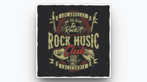
4. Retro Vintage Distressed Logo
A retro vintage distressed logo uses old school typography, throwback mascot styling, and a lightly worn texture that makes the design feel broken in from day one. The look usually includes a classic wordmark or mascot mark paired with a subtle distressed finish, giving it that weekend thrift find vibe without looking messy.
What separates this from a modern logo is the era cue. Rounded letterforms, vintage athletic fonts and simplified mascot shapes signal nostalgia immediately. The distressing should support the retro feel, not reduce readability. Think of it as adding character, not hiding the design.
Why it sells
This style performs because it feels authentic and collectible. Buyers love the idea of school pride that does not look brand new or overly promotional, which makes it especially popular with alumni, parents and older students who want something more lifestyle than loud.
Best placements and products
Full front on tees is the strongest match because the texture reads naturally across a larger area. It also works well on crewnecks and hoodies for a relaxed heritage look and it can be used as a back graphic with a small front mark for a modern vintage drop.
Who it is for
Best for alumni and parents, with strong crossover for high school students who like streetwear leaning designs. It is less effective for elementary audiences unless you keep the mascot friendly and the texture very light.
Design tips
- Use light distressing that keeps the school name fully readable.
- Choose one retro font family and stay consistent across lines.
- Avoid tiny text like long slogans, the texture can swallow fine details.
- Pair the design with muted or classic garment colors for the true vintage effect.
5. State or City Pride Map Design
This design features a simplified outline of your state or city paired with the school name, mascot or initials, creating a clear connection between the school and its hometown. The map shape acts as the anchor, while the school elements sit inside the outline, cut through it, or overlay it in a clean, intentional way.
The strength of this style is local identity without needing a long message. It works best when the map is minimal and the school name stays dominant. If the outline becomes too detailed or the typography competes with the shape, the design starts to feel like a travel graphic instead of school spirit wear.
Why it sells
People buy this because it signals hometown pride and community membership. It performs especially well for families, alumni, and supporters who want something that represents both the school and the place, which makes it a strong choice for fundraising stores and community events.
Best placements and products
Back print on tees and hoodies works well because the map shape benefits from extra space, with a small front mark on the left chest to keep it balanced. It also performs on crewnecks with a centered front placement when the map outline is bold and simplified.
Who it is for
Best for parents, alumni, and community supporters, with good crossover for students when the design feels modern and clean. It is also great for schools with strong town identity or when the mascot name references the city or region.
Design tips
- Use a clean outline and remove tiny map details that will not print well.
- Keep the school name readable first, the map is the backdrop, not the headline.
- Add one local cue like the town name or established year but keep it minimal.
- Avoid stacking too much text inside the outline, it quickly becomes crowded.
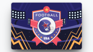
6. Sport Specific Team Edition
This design is built around one sport at a time, combining the school name or mascot with the sport label and a simple athletic element like a ball, equipment icon or jersey style number. The key is clarity, so someone can instantly tell it is football, basketball, baseball, soccer, volleyball or another program without reading a paragraph of text.
What makes this style work is the connection to a real schedule. The design feels purpose built for games, tournaments, and team community, so it becomes the item families wear to show support in the stands. It also allows you to create multiple versions across sports without changing your core school identity.
Why it sells
This design sells because it maps to pride and momentum. When a season starts or a team is on a run, buyers want a visible way to support the program. It performs best right before the season, during playoffs and around rivalry games when excitement and attendance spike.
Best placements and products
Full front for tees is the workhorse for game day wear, with the sport name and mascot centered and bold. Back print also performs well for team families, especially when paired with a small front mark. Hoodies and crewnecks are strong during fall and winter seasons, and hats work best when the sport element is simplified into a small icon.
Who it is for
Best for players, team families, and student supporters who want to represent a specific program. It also works for coaches and staff when the design stays clean and less playful. For youth sports, keep icons direct. For high school, add stronger athletic styling and bolder type.
Design tips
- Keep the sport label short and obvious, use soccer not futbol for US audiences.
- Use one sport icon max, multiple icons make it look cluttered.
- Consider adding a number style element only if it stays readable at a glance.
- Build a consistent system so every sport version feels like part of one collection.
7. Senior Class and Graduation Year
This design spotlights a specific class year, usually built around “Class of 2026” or a large year number paired with the school name and a supporting element like the mascot, initials, or a simple laurel. The year is the hero, while the school branding confirms identity and keeps it official enough for families to buy confidently.
What makes this style distinct is personalization at scale. It feels custom to one group without needing individual names, so it becomes an easy, high-volume seller when seniors want something that marks their final season and parents want a keepsake they can wear or gift.
Why it sells
It sells because it captures a milestone and creates a natural deadline. Seniors feel pride and status, families feel nostalgia, and everyone understands that the design only makes sense for that year. It performs best during senior season, graduation months and any event where the class is being celebrated.
Best placements and products
Full front works best when the year number is large and bold on tees and hoodies. Back print is also strong for senior events when you want the year to be visible in photos, with a small front mark for balance. Crewnecks are a top choice for keepsake wear, especially when the layout feels clean and timeless.
Who it is for
Designed for seniors first, with strong appeal for parents, relatives, and staff who support the class. For middle school promotion years, keep it direct and more playful. For high school and college, use a more premium layout that feels photo ready.
Design tips
- Make the year the largest element, then support it with the school name and mascot.
- Avoid tiny supporting text like long quotes that will not read in photos.
- Keep the design clean so it still feels wearable after graduation.
- Add one subtle detail like a laurel or outline, not multiple decorations.
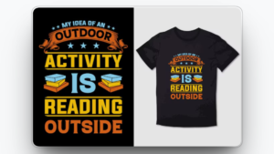
8. School Chant or Slogan Typography
This design is built around a short chant, rally phrase or school saying that people already repeat at games and events. Instead of relying on a mascot graphic, the words are the main visual, usually set in a bold type style with tight spacing and a clear hierarchy so it hits like a statement.
What makes this different from a generic quote shirt is that the slogan is uniquely tied to your school culture. The best versions feel like an inside signal that students and families instantly recognize, while still being simple enough that a new supporter understands it on first read.
Why it sells
It sells because it creates identity and group energy. Buyers love wearing language that feels like belonging, especially when it is connected to game day traditions or school pride moments. It performs best during pep rallies, homecoming, rivalry weeks and any period when the community is actively showing up.
Best placements and products
Full front is ideal for maximum impact, especially on tees and hoodies where the phrase can be large and legible. Sleeve placement works well as a secondary hit when the main school mark is on the chest, and back print performs when you want the slogan visible in crowd photos.
Who it is for
Best for students and student supporters because it feels current and expressive, with strong crossover for parents who like clean text designs. For younger grades, keep slogans straight and positive. For high school, stronger and more energetic phrases perform better.
Design tips
- Keep it to three to five words so it lands fast and reads cleanly.
- Use one font family with weight variations for hierarchy, not multiple fonts.
- Avoid slang that could age out quickly or confuse parents and alumni.
- Pair the slogan with a small school identifier so it still feels official.
9. Mascot Character Illustration
This design uses the mascot as a full character graphic, not just a small logo mark. It can be a bold illustrated mascot head, a full body pose, or an action stance that feels energetic and expressive, often paired with a short school name or initials to keep the identity clear.
What makes this style unique is personality. The mascot becomes the main attraction, so the illustration style matters, whether it is friendly and approachable or sharp and athletic. The best versions keep strong outlines and simplified shapes so the graphic prints cleanly and still looks great from a distance.
Why it sells
It sells because characters create emotional connection and instant recognition, especially for students and younger families. A strong mascot illustration also becomes a visual signature for the school, which makes it a popular choice when the community wants something fun that still feels like official spirit wear.
Best placements and products
Full front is the strongest placement because the mascot needs room to show expression and shape. Back print also works well for louder designs, with a small front mark to keep it balanced. Hoodies and tees are top performers for this style, and it can work on hats only if you convert the illustration into a simplified mascot head mark.
Who it is for
Best for students, especially elementary and middle school audiences, plus parents buying for kids. High school students will buy it more when the illustration feels athletic and modern rather than cartoonish.
Design tips
- Use bold outlines and simplified details so the mascot prints clearly on all sizes.
- Limit color count and avoid heavy gradients that can look inconsistent in print.
- Keep the mascot pose readable, too much action can turn into visual noise.
- Pair with short text like initials or the mascot name, not long school wording.
10. All School Pride Design
This design is built around a unifying message that represents the whole community, not a specific sport, class, or event. It typically combines the school name with inclusive wording like “Proud,” “Spirit,” or “Community,” and uses a clean layout that feels appropriate in multiple settings, from game day to everyday wear.
What makes this style unique is neutrality with purpose. It avoids narrow references and instead communicates belonging at the school wide level, which helps it stay relevant longer and reduces the risk of excluding groups. The best versions feel confident, not generic, by anchoring the message with strong school identity cues.
Why it sells
It sells because it gives everyone a clear way to participate. Parents, staff, and supporters often want to show pride without choosing a specific team or moment, and this design solves that problem. It performs best for fundraising launches, school wide campaigns and year round store staples.
Best placements and products
Left chest works well for a clean, uniform look on quarter zips, crewnecks, and hoodies. Full front is a strong choice on tees when you want wider visibility at events like open houses and school fairs. Hats also perform when the message is shortened into a compact mark with initials.
Who it is for
Best for parents, staff, and community supporters, with solid crossover for students who prefer minimalist designs. For younger grades, keep it friendly. For older students, use a more modern, minimal layout so it feels wearable outside school.
Design tips
- Keep the message broad and school positive, avoid references that only one group understands.
- Anchor the design with the school name or initials so it never feels generic.
- Use clean spacing and medium weight type for a polished, everyday look.
- Create two versions, one bold for tees and one minimal for staff friendly items.
11. Limited Edition Event Drop
This design is created for a specific moment on the school calendar, such as homecoming, rivalry week, playoffs, spirit week or a championship run. It usually includes the event name, year, and a strong visual cue like the opponent reference, a trophy or bracket style element, or a themed graphic that clearly marks the occasion.
What makes this design different is documentation. People buy it because it captures a memory and signals attendance, support, or participation. The best event drops feel special but still wearable after the event, which means the layout should be clean and the wording should not be overly crowded or gimmicky.
Why it sells
It sells because timing creates urgency without needing hype. Buyers understand the window is short and the moment will pass, so they purchase to commemorate it and to wear it during the event itself. It performs best two to three weeks before the event and during the event week when excitement is highest.
Best placements and products
Back print works especially well because it gives space for the event name and year, and it photographs well in crowds. Pair it with a small front mark on the left chest for a clean, premium look. Tees are the fastest movers for event week, while hoodies and crewnecks win in cooler months and for keepsake value.
Who it is for
Great for students, parents and supporters who attend the event, plus staff who want a commemorative piece. Alumni also buy it when the event is a big tradition, especially rivalry games or championship runs.
Design tips
- Put the event name and year in the top two positions so it reads immediately.
- Keep details minimal, too many lines of text make it look like a flyer.
- Avoid humor or references that could age poorly after the event.
- Use a consistent event series style so future drops feel collectible.
12. Monogram or Initials Mark
This design uses the school initials as the main graphic, often in a clean monogram, stacked letters, or a simple interlocking style. It can include a subtle mascot hint or a small supporting detail like the school name in tiny type, but the initials remain the hero for a refined, modern look.
What makes this style unique is versatility. It feels less like a loud spirit shirt and more like an everyday brand, which is why it pairs well with premium garments and neutral colors. The strongest initial marks look intentional and balanced, not like random letters placed together.
Why it sells
It sells because it looks wearable anywhere. Buyers who want school pride without a big graphic choose initials because it feels clean, mature, and easy to style. It performs especially well for staff gear, parent staples and alumni pieces that people can wear outside school settings.
Best placements and products
The left chest is the top placement on hoodies, crewnecks, and quarter zips because it feels polished and minimal. It also performs extremely well on hats and beanies since initials translate cleanly to embroidery. For tees, a small front mark with a larger back version can create a premium streetwear feel.
Who it is for
Best for parents, staff, and alumni, plus older students who prefer subtle designs. For younger students, it works when paired with brighter colors or a small mascot detail but keep the mark simple.
Design tips
- Use bold letter shapes with enough spacing so the mark stays readable at small sizes.
- Avoid overly complex interlocks that blur when embroidered or printed.
- Keep it to one to two colors for a clean, premium finish.
- Test it on a hat mockup early, if it works on a hat, it will work anywhere.
How to Choose the Right 3 Designs for Your School Store
Choosing three designs is about coverage, not creativity. Your goal is often to serve the biggest buyer groups with a small set that feels consistent and easy to shop, while avoiding designs that only work for one narrow moment.
1) Pick one design for instant school identity
Choose a design that clearly says who you are in one glance. This typically becomes a bestseller and the one parents feel safest buying.
Best fits: Classic School Name + Mascot Lockup or Varsity Letterman Typography
2) Pick one design that feels premium and wearable anywhere
Add a cleaner option people can wear outside school events. This is the design that performs well on staff items, quarter zips, and hats.
Best fits: Minimal Crest or Badge Emblem or Monogram or Initials Mark
3) Pick one design that creates energy or urgency
Your third slot should drive excitement and repeat buying. Choose a design tied to a moment, a season, or a community signal that students love.
Best fits: Sport Specific Team Edition, School Chant or Slogan Typography, or Limited Edition Event Drop
Quick match guide by audience
- Student heavy schools: identity + energy + premium
- Parent driven stores: identity + premium + one seasonal drop
- Alumni focused communities: identity + premium + retro
Final check before you launch
Make sure each design looks strong on at least two top products and that your three picks feel like one consistent collection. If you want a smoother setup, Varsity Vault can help you align the designs with your school colors, build the store and handle fulfillment so you can focus on promoting the drop.
FAQs
How many designs should a school store launch with?
Start with three. Use one identity design, one premium everyday design and one seasonal design.
What if students and parents want different styles?
Use one bold student option, one clean premium option for adults and one seasonal option tied to sports or events.
Which products should we design first?
Start with hoodies, tees, crewnecks and hats. Add extras only after you see steady demand.
How do we avoid print surprises?
Design for the decoration method early, limit fine detail and check readability on a small mockup before publishing.
What decoration method works best for small left chest designs?
Embroidery or a clean single-color print often works well, depending on the fabric and detail level.
How many colors should we use in a design?
Use as few as possible while keeping contrast and brand accuracy. Too many colors can raise cost and reduce consistency.
What is the biggest reason spirit wear stores get stuck with leftovers?
The product mix is too wide, the designs are too niche or the design does not look good across multiple items.
When should we launch an event design?
Launch early enough for production and shipping and keep the event layout clean so it still feels wearable after the event.